VISUAL DESIGNER & DEVELOPER

QuillPen Press
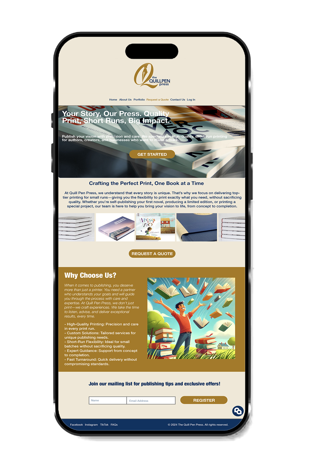
DETAILS
The design was chosen to reflect professionalism and creativity in the printing industry. A neutral color scheme with gold accents conveys elegance and reliability. The structured layout highlights key services, while clear call-to-action buttons encourage user engagement. High-quality images of printed materials reinforce the brand’s expertise, and the “Why Choose Us?” section builds trust with potential clients. The overall design ensures clarity, accessibility, and a seamless browsing experience
The presentation was created using Photoshop and Adobe Illustrator. The main goal was just to create a visual presentation of the design, to explore color schemes and layout, focusing on design rather than navigation or functionality.
KINVARA
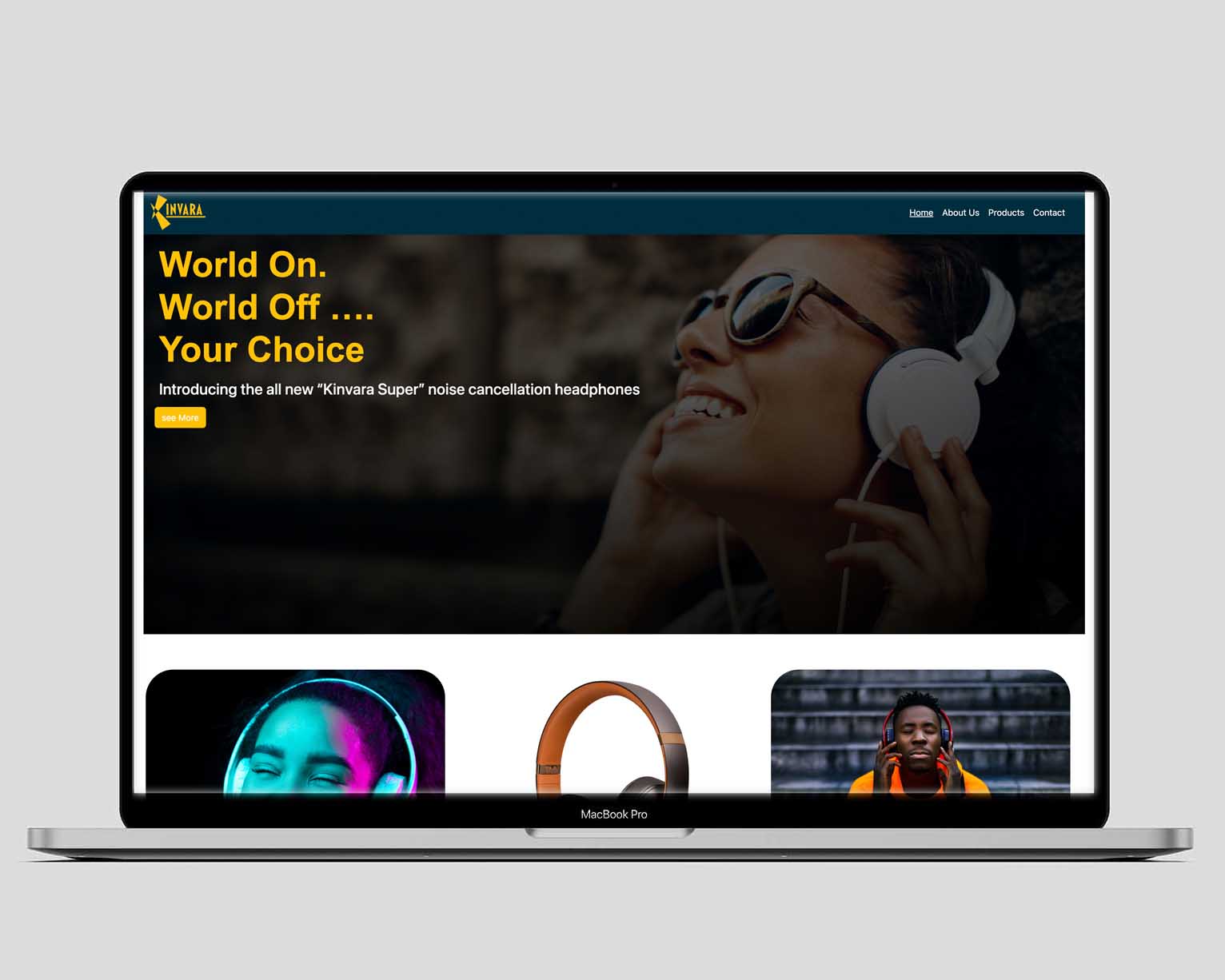
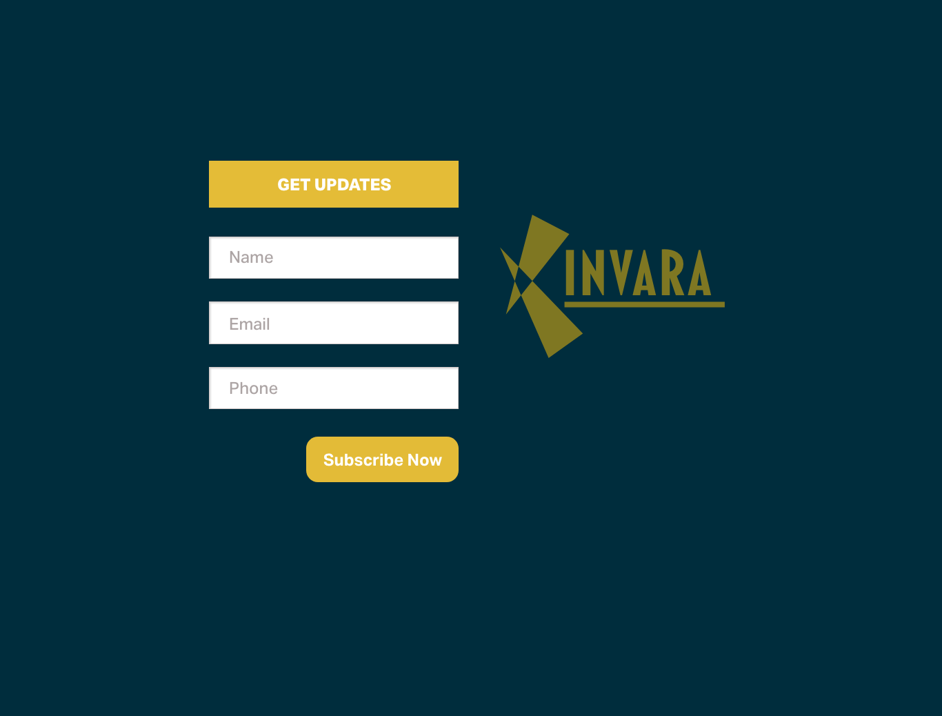
DETAILS
This project was created for a headphone brand, focusing on both visual aesthetics and front-end development. The design was chosen to highlight the innovation and quality of the noise-canceling headphones. Dark tones with yellow accents were used to create a modern and energetic look. The main image reinforces the idea of immersion, while the slogan emphasizes the user’s control over their listening experience. Vibrant product images make each model stand out, and a simple navigation menu ensures easy access to key sections.
The development process involved coding the landing page using HTML, CSS, and Bootstrap within Visual Studio. Special attention was given to responsiveness, ensuring a seamless user experience across different screen sizes. Interactive elements, such as scrolling effects and call-to-action buttons, were implemented to enhance engagement.
The overall goal was to combine a strong visual identity with a functional and user-friendly interface, effectively communicating the brand’s message and product features.
Bistro Luna

DETAILS
This project was created for Bistro Luna, a restaurant focused on delivering an exceptional culinary experience. The design was chosen for its visual appeal and ease of navigation. A striking food image was used to immediately capture the user’s attention and stimulate their appetite. Warm and elegant colors (black, gold, and white) were selected to reflect the restaurant’s sophistication. The structure is simple and clear, featuring a prominent button for table reservations and a dish gallery to showcase the best menu offerings. Additionally, the location and hours were placed in a visible spot to ensure customers could easily find them.
The design phase began in Figma, where the layout, typography, and color scheme were meticulously crafted to evoke a warm and inviting atmosphere, reflecting the essence of fine dining.
The development process involved coding the landing page using HTML, CSS, and Bootstrap within Visual Studio. Special attention was given to responsiveness, ensuring a seamless user experience across various devices. Interactive elements, such as smooth scrolling effects and strategically placed call-to-action buttons, were incorporated to enhance user engagement and encourage reservations.